
Branding
CoachIQ
A scalable design system that lets a fitness platform ship screens faster
- Design system
- Client
- CoachIQ
- Industry
- Fitness technology
- Our role
- UI kit and design system
- Deliverable
- UI kit and design system
The challenge
Growing products slow down in a predictable way: every new screen is designed from scratch, small inconsistencies creep in, and the interface slowly stops looking like one product.
CoachIQ, a fitness coaching platform, needed the opposite: a system its team could assemble new screens from, quickly and consistently, as the platform grows.
Our approach
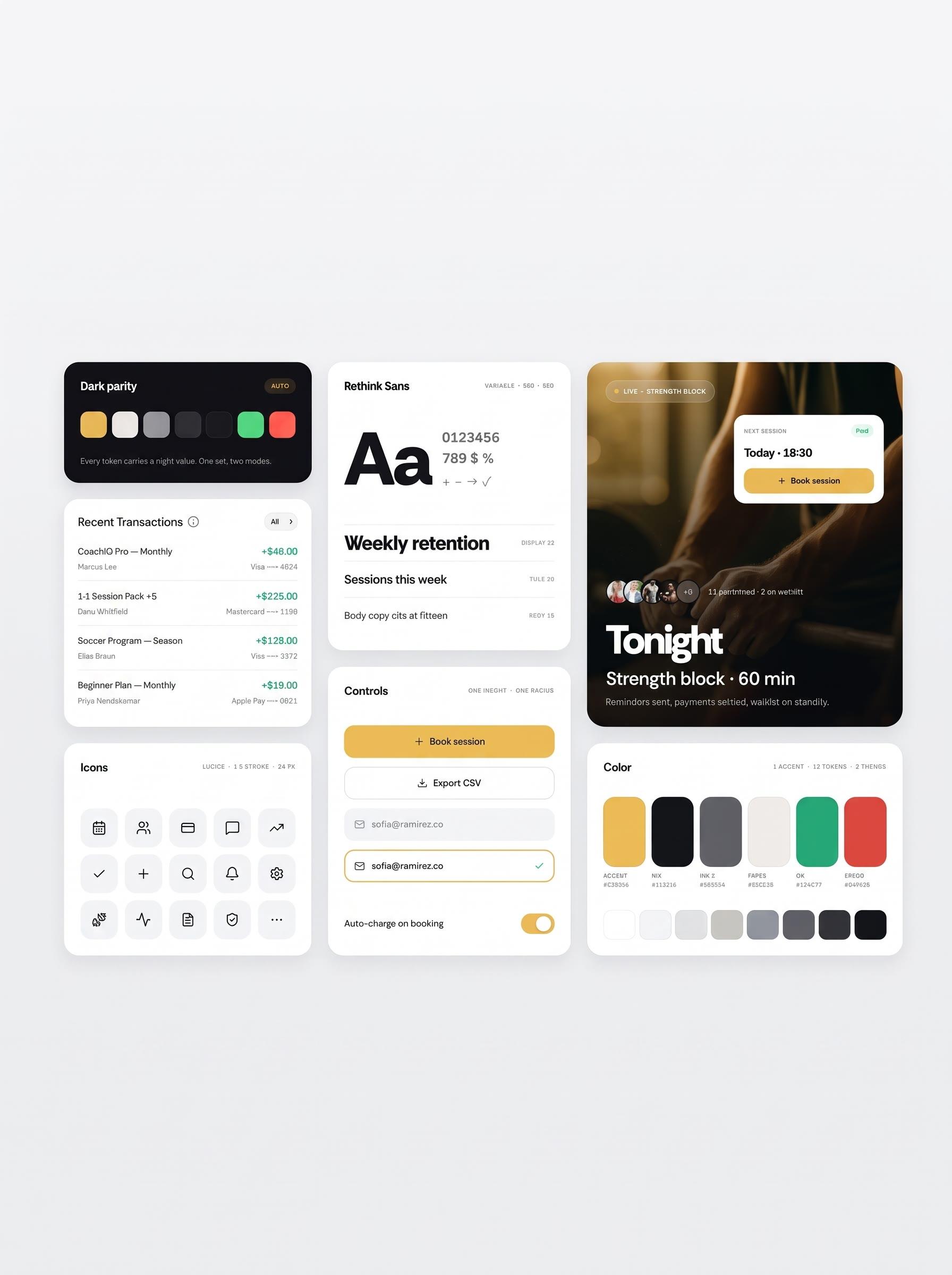
We built a scalable design system rather than a set of finished screens: reusable UI components that cover the platform's recurring patterns, so new features start from proven parts.
Dark mode was designed into the system's tokens from the start, and typography was unified across the platform, so consistency is a property of the system, not a discipline each designer has to remember.
What we built
- 01
Reusable UI components
A component library covering the platform's patterns, turning new screens into assembly instead of invention.
- 02
Dark mode tokens
Colour and surface tokens defined for both modes, so dark mode is designed, not inverted as an afterthought.
- 03
Unified typography
One type system across the product, ending the drift that makes growing apps feel patched together.
- 04
Scalable UI kit
A kit built to grow with the platform: new components extend the system instead of breaking it.
Results
- Complete design system delivered for the fitness coaching platform
- New screens can now be assembled from reusable components with a consistent look
- Dark mode and typography standardised across the product in one system
Keep exploring
Is every new screenslowing your team down?
Tell us where your product's design keeps drifting, and we will build the system that holds it together.